
wealth management and fintech usability- because confusion is expensive
my blog for thoughts, ideas and self diagnosed wisdom

the ux of financial jargon: when familiar language becomes a usability problem
Financial jargon is often technically correct but practically unhelpful. Good UX keeps the accuracy and removes the guesswork.

from self serve to human backed: making support feel built in, not bolted on
modern finance ux needs visible human oversight and fast routes to real help - part 3

from charts to explanations: making financial insights feel calm, specific and real
understand what changed and what to do next - part 2
from navigation to guidance: why wealth portals are becoming paths, not menus
from navigation to guidance is the shift i called out, where the interface becomes a path that reduces guesswork - part 1

information architecture for wealth platforms: navigation that matches mental models
good information architecture in wealth platforms maps navigation to client jobs, keeps labels consistent and treats documents and help as first-class destinations

dark patterns to avoid in financial ux: ethical design for long-term trust
avoid dark patterns in financial ux by making choices clear, consequences visible and opt out as easy as opt in

ux metrics for wealth products: measuring adoption, engagement and task success
measure wealth ux with a small set of adoption, engagement and task success metrics

adviser discovery ux: making human support feel one tap away
adviser discovery works when help is predictable, fast to access and keeps context so clients don’t have to repeat themselves.

designing for life events in wealth management: retirement, inheritance and divorce journeys
build guided journeys that reduce decisions, show progress and keep users calm under pressure

notification ux for wealth apps: what to send, when to send and when to stay quiet
vague noise turns normal updates into instant anxiety

documents ux in finance systems: find, filter and download without friction
document ux is judged in real life: under pressure, on mobile, with zero patience

forms ux in finance systems: handling complex data without overwhelming users
great forms ux stages complexity so users feel guided, not interrogated

error message ux in wealth platforms: how to fix problems without blame
the best error messages reduce anxiety by making recovery obvious

microinteractions in wealth ui: subtle feedback that reduces anxiety
microinteractions reduce uncertainty by making the system’s state obvious

the psychology of trust in finance ux: signals that calm and signals that alarm
trust is built when uncertainty is removed, not when polish is added

service design in wealth management: designing the adviser and client journey together
great wealth management ux happens when the service, usability and the interface are designed together

information architecture for wealth platforms: navigation that matches mental models
good information architecture makes finance feel simple by making navigation predictable

usability testing in fintech: what to test in a wealth management experience
test the high-stakes journeys first and triangulate when access to users is limited

personalisation in digital wealth management: fine line between useful and creepy
personalisation should feel like helpful memory, not upsell
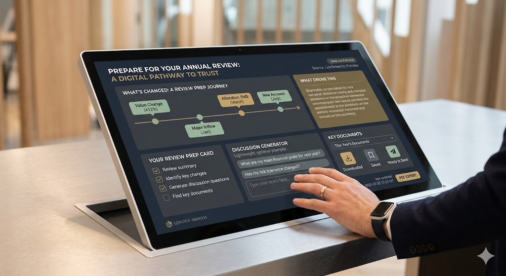
usability for annual reviews: prep that builds trust
annual review ux should help people prepare fast, understand change and ask better questions